When to Test What: Validating Standard Features & Game-Changers

As a user researcher, I’m always inclined to say, “Test everything, all the time!” when people ask, “What/when/how should we validate with users?” That’s my pie in the sky: the place where there’s all the time and all the budget in the world to get every last detail or spec just right for the good of the user, the product, and, ultimately, the business. But that’s not real life. Projects run on strict budgets and tight timelines, and there’s not always a lot of wiggle room.

So, in the absence of all the time and all the budget in the world, we have to prioritize, compromise, and make some assumptions.

First things first: Know your users. Define your audience, zero in on their major goals, and understand what data they need and how they need to see it. (Learn more about quick audience definition activities in my previous posts 4 Ways to Kick-Start Lean User Research for Agile Product Teams and Tips for Lean Audience Definition with Time-Crunched SMEs, and read about data discovery in Chris LaCava’s post Effective UX Design in an Agile World.) Once you’ve got a handle on your users, you can get started designing and building for them, and figuring out what needs validation now and what can slide by for a few cycles without validation. But how?

Let’s take a fake product example. We’ll call it Pacemate. Pacemate is a fake fitness application for serious cyclists that they can use to track cycling activities in real time and compare data points across their own cycling history as well as others’ history.

Let’s say you’ve got a pretty good understanding of your target end-users after a brief discovery process that homed in on what serious cyclists want in a tracking application. These enthusiasts are interested in stats around endurance, time, elevation, pace—basically anything to do with performance. They’re not focused on how many calories they burned or even what level their heart rate reached. First and foremost, they want to not only track their performance but also understand how certain variables affect their performance, such as time of day, time of year, what they ate for breakfast, and on and on.

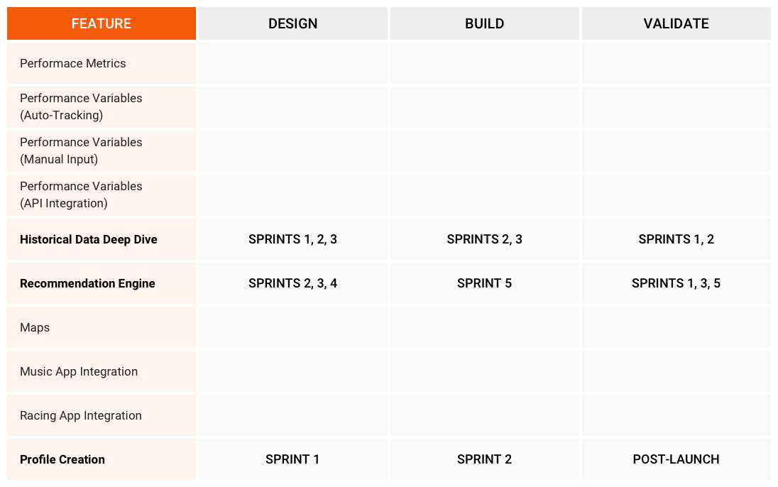
After some back-and-forth with your product team, you’ve decided on a feature set for your first release (MVP) and a five-sprint goal for completion.

Now that you’ve got a proposed MVP feature set, you’re anxious to get to the finish line. But you want to do right by your users in addition to your budget. So what should you start building, what should you start designing, and what should you start testing?

1. When to Assume: Use UI Patterns & Validate Later

UI patterns are good solutions to common design problems. For example, a wizard is a useful solution for helping users get through a stepped process. Patterns are extremely useful in creating experiences for users that are comfortable and familiar, and will not force them to learn new ways of using an interface for no perceptible reason or benefit.

Several components of most personalized applications already have tried-and-true patterns that you can follow without much apprehension about alienating your end-user. Features like account creation and even profile creation come with pretty standard design guidelines. If your profile and account creation promise no surprises, stick with those patterns.

More specifically, in a market that has several other competitive applications similar to the one you’re creating, focus your validation time and budget on those features that will be the game-changer for your product. Sometimes this might just be a feature that’s already in the market but has been executed poorly everywhere. With Pacemate, features like auto-tracking and manual-input diaries are wheels that don’t need to be completely reinvented—but should be retested eventually.

To validate features that use a proven pattern or that already succeed in the marketplace, it’s OK to wait until after you launch the MVP. Consider using asynchronous automated testing services like UserVoice, or simple analytics tracking to ensure that your users like what they’re seeing and doing.

2. When to Compromise: Build Back End While Validating Front End

Some components of data-rich applications really should be validated up-front to make sure that users will experience the data in ways that are useful to them, but it’s probably OK to get started building in tandem with validating. These are components that need user input eventually, but will be easy and/or inexpensive to refactor if we get it wrong in the first go-round. It’s the difference between accuracy and precision. Precision is typically easy and cheap to fix with user feedback in the real world, but accuracy is a different story. If your solution isn’t accurate, it will be painful to course-correct down the road.

With the Pacemate product, the deep dive into historical data is one of those features that can be built in tandem with design validation. Assuming you’ve done your due diligence in a data discovery phase, get the known foundational components of the architecture set up, such as APIs and communication channels, while testing how users want to visualize the data, how they want to filter it, and what they might do with it next. Once you’ve validated with users, you can continue honing both the back-end architecture and the front-end design. You might even end up with great ideas for new features or feature enhancements.

3. When to Prioritize: Validate First, Build Later

What’s the game-changer in your product? What do you have that no one else in the marketplace has? Maybe it’s a graph database? Maybe it’s another link in the Internet of Things chain? Maybe you’re developing some artificial intelligence that can speak cat’s meow?

The game-changer is where you need to spend the most time validating before you build it. Not only is it the main thing you’re betting the farm on; it’s also most likely a relatively difficult implementation. If it hasn’t been done before, you don’t have a template you can start from to understand what your users want or to build it. You might think it’s the Next Big Thing, but your end-users might not, at least not in the iteration you’ve created in your mind.

Revisiting our fake product, what does Pacemate have that all the other cycling apps don’t have? And how easy or difficult is that game-changer to build and, potentially, refactor if it’s wrong?

Pacemate’s major player is likely to be its recommendation engine, where users can get real-time recommendations on what foods to eat before a race based on their personal historical performance, or specific races that would give them the best performance. This is a powerful tool but also one that’s easy to get wrong, and difficult to implement. Make sure you get it set up the way your users want before you start building. You’ll save a ton of time and money on refactoring.

Validating product ideas is an art as much as a science. Figure out what’s easy, what’s difficult, and what’s already been done, and go from there. But make sure your users are along for the ride.


Originally published by Expero.

Designing and Developing Next-Generation Free-Text Search

Co-written with Karim Jamal & Chad Huff. Originally published by Expero.

What does the term “search” mean to you? On any given day, we perform numerous searches, many consciously and many without even realizing. We do several web searches every day, either by keying in search terms or by using a voice assistant. When we enter a location into a maps app before starting to drive, we’re actually searching for the best route to wherever we’re going. And don’t forget the mental search for the car keys that some of us do every morning.

Search is everywhere in our lives. Each of these searches is a different type of search. There are different ways to interact with search technologies, different ways that the information will be retrieved, and different ways in which you will use the information you get.

So what type of search do you design for your application or website? There are a number of considerations to take into account: What do your users want to search for? How are they used to searching? What are the most natural ways for users to search? How do you go about developing a search solution? When tackling this, you have to be aware of the cross-disciplinary considerations that go into making such a decision. Taking into account user perspectives, UX patterns, and development considerations will help create a successful outcome.

Note: In this post we’ll look specifically at text searches.

User Perspectives

There is no real user persona or specific demographic for search, because everybody does it. Search is agnostic of gender, age, health, location, education, income, etc. The key in considering user perspectives on search is to understand not only who searches, but also why users search.

Motivations for Search

Users search for a number of reasons. You can probably look back on your morning and come up with a handful of things you’ve already searched for, and all for different reasons. But those searches might have something in common at a high level. Bubbled up, users search to:

Know: These searches are informational. The user is typically looking for a cut-and-dried, clear answer to a factual question. In these scenarios, one answer or search result will typically suffice.

Understand: Sometimes users have an aspirational motivation to search on a topic or a theme. They want to learn about something, so there is no clear endpoint or right or wrong answer. Users will often sift through multiple results when conducting these searches.

Do: More and more, we’re seeing searches for “how to” do something. These are action-oriented searches that help the user complete a task. Typically one result will suffice, but it’s not always the first result the user sees, so some time is spent seeking the best one.

Find: Often users look for something that will likely precipitate an action, such as finding a website or a location or a bargain. These anticipatory searches are neither clear-cut nor amorphous; a user can spend time looking for the best deal or the best route.

Screen Shot 2017-02-22 at 12.34.01 PM.png

Now that we know why users are searching, we can begin to look at what they expect from a high-quality textual search experience.

Expecting More from Search

As with most emerging tech trends, users are expecting more and more from their interactions and experiences with search. The key differentiators for next-gen search are:

  • Relevance: Search results should reflect that the system understands what the user is asking and knows what to suggest.
  • Personalization: Searches and search results are personal to the user, or what the search engine knows about the user.

  • Contextualization: Searches and other user activities are linked to one another so search engines have richer context for what the user is seeking and why.

Users search for a variety of reasons, but their behaviors and motivations often share commonalities across geographic, demographic and psychographic divides. The next step to creating a valuable search experience is to identify how the search mechanism should work.

UX Patterns

Which user interface elements or patterns do you leverage when creating a search tool? There are a few guidelines and patterns we use most often. But first, let’s clarify the difference between search and filter. Filtering takes an existing list or visible data and removes items based on criteria. Searching takes a blank slate and adds to it based on criteria. How we provide the criteria for the search (or filter) depends on the user’s need and the complexity of the query.

Attribute-Based Search is used when needing to specify one or a few attributes to achieve a desired set of search results. This most often looks like a text field for capturing text and numbers with a way to select a type or category to search within, e.g., picking a department to search within Amazon.

In Slack, you can narrow your search before you enter or as you are entering text.  

Another common pattern is Completion Suggestion. When a user may not know the exact details to manually type into a text field, or typing the full information might be inefficient, a drop-down-like menu can appear under the active text box with suggestions for completing the “intent” of what the user has started typing in a field.

Suggestions can be categorized in the list. If there can be confidence in a “top hit”, making a completion suggestion can also show filling in the rest of the text query in a visibly different style. A word of caution to take a suggestion to autocomplete: A user may want to hit “enter” or submit the query incomplete to see all results. Be sure to design for that path as well. (Note that completion suggestion and autocomplete are not the same thing.)

Search Forms are often used when several attributes are required to present useful results. The forms you’ve likely used on travel sites are a good example of these forms that allow the user to define specific criteria.

image02.png

Expero worked with Intersil to create a configurable search form to define criteria to find solutions (parts).

There are other patterns like Search History that could be useful, but we are seeing new patterns emerge, too. As users begin talking with their devices, we see voice or visual input methods for creating queries as well as passive methods like location. As technology advances, our patterns may have less UI or more UI. The goal is to give the user the best user interface for the query they want to write, build, say, or be.

Development Considerations

When it comes time for how search will be developed, a lot of detailed questions start coming up. This is the point where the tire actually meets the road, so the small details need to be clarified; otherwise, chances of veering off the road increase quickly. From personal experience, we can confidently say that search can mean something different depending on whom you’re asking. Unless the expectations are clearly laid out, chances are that the end result will vary from what was actually expected at the outset.

Getting the requirements correct is not only to make sure that you’re building the right thing, which is obviously very important, but also to be able to estimate the effort and resources needed to complete the feature. A free-text search can get very complex very quickly. For example, let’s take a simple query:

Imagine that this is backed by a simple data store that has a table or node for employee information. This would then translate to getting all employee records where the start date was in 2016. In this case, there is very little preprocessing of the query that is needed to understand its meaning.

It’s easy to see how this type of free-text searching can get a lot more complex. Let’s take a look at a more complex query:

There is a lot more going on here. No simple querying of the data store is going to be able to answer this query in a straightforward way. What makes this so difficult? There are loads of context hidden in this search. The user is expecting the search to know information about herself, so the answer will need to weave together results from several tangential sources. Here’s a closer look at some of the preprocessing the search will have to perform just to understand what the user is asking for:

Comparing the simple and complex queries, it becomes obvious that building the latter can be magnitudes more costly than the former. Building the latter when only the former was needed will lead to a lot of wasted effort. At the same time, building the former when the latter was needed will lead to unamused reactions from your directors. Thus it’s important to figure out how “smart” your search needs to be.

Summing Up: Gathering Requirements

So what questions do you raise and consider early on in the process to make sure you are on the right track with your search tool? We have prepared several questions about the user, the behavior, the search query and the search results to aid in getting these answers.

Users:

  • Who will be searching?

  • What are they likely to search for?

  • What is the intent behind their search?

Design:

  • How complex are the search queries?

  • How do users want to see results?

Implementation:

  • What exactly are we searching? Is it going to be one field in one database table or node? Multiple fields? Multiple tables/nodes? Everything?

  • Will there be completion suggestions? If so, what do we show in the suggestions?

  • Is there any sorting or relevance that needs to be applied to the suggestions?

  • Do the suggestions need to be grouped in any way (e.g., “top hit”)?

  • How many suggestions should be shown?

Armed with this question checklist and a better understanding of how the different disciplines influence your search experience, you will be better equipped to build the appropriate experience for your users. Additionally, a clear understanding of what’s being built will lead to better estimates and a higher satisfaction rate from the stakeholders once the feature is complete.

Can Research Data Be as Sexy as Design? You Betcha.

Co-written with Visual/UX Designer Jonny Hill

If you read my previous post about why product owners and stakeholders have a tendency to skip over discovery research and go straight to design—and then skip over validation research and go right to release—you know that one of the main drivers is the fact that looking at designs is fun. Looking at numbers and bulleted lists of findings is not (as much) fun (for stakeholders). With designs, they get to see their product progressing and growing from inception to build. Data is more behind-the-scenes; it may drive design, but so what?

So. What if we changed the game? What if we could make research as sexy as design?

It’s not a foreign concept. Look at the advent of the infographic. It takes research on anything—even research on why infographics are stupid—and makes it look cool (or at least entertaining).

It’s not pages and pages of dry reporting with numbers and words and maybe a few bar graphs or tables. It’s neat! It has colors and images! It grabs your attention!

...And it’s also likely not created in Word or PowerPoint, which is how many of those research reports get passed around. These tools encourage the use of text over imagery. You can create an interesting template in Word or PowerPoint, but it’s challenging to translate your data into a visual that is easy to construct, modify and understand.

We don’t want to make pretty research visualizations just for the sake of looking cool. They need to be useful, usable and reusable. We need to take into consideration “the UX of data.” If our goal is to make data more interesting and more actionable, then we need to approach it with the end-user, or stakeholder, in mind.

Take personas—a traditional research visualization. A persona necessarily contains a lot of text because we need to understand the user’s story, her narrative, her needs and goals, her motivations and behaviors. Those aren’t things that are easily—or efficiently—conveyed through images instead of text. But over the years we in the industry have made them more interesting by telling the story through images and text.

Here’s the thing: You need both. No one wants to read a six-page research paper or watch a 30-minute slideshow about a fictional user. The persona needs to be prepared with the stakeholders in mind, and presented in a way that is clear, digestible and helpful. The visualizations should reinforce and accurately represent the data, and the data needs to be easy to understand and to the point. When these elements are skillfully and thoughtfully combined, stakeholders aren’t just more likely to care about personas; there’s a good chance they’ll become more enthusiastic about the project as a whole. It’s much easier to care about something that has been explained clearly and concisely.

What’s more, persona templates are largely reusable. Sure, every project has its own niche needs and goals (just like its users!), but most visualizations can be repurposed or created quickly.

And best of all, stakeholders love well-crafted personas (after they’re created). They can use the personas in so many areas of business, not just for designing an app or tool. Personas are useful in marketing, requirements gathering, R&D...you name it. The end-user is, or should be, front and center everywhere.

How, then, can we translate that text-image balance of personas into a report of findings about usability testing or survey results or contextual inquiries so stakeholders find them as visually interesting (okay, maybe not as interesting) as wireframes and design concepts?

Visualizing Word & PPT

Well, for the more formal efforts—when stakeholders want a report to digest, pass around, come back to, and show their bosses—it’s a good idea to maintain the traditional PowerPoint or Word format but jazz it up wherever you can. A little typographical love can go a long way.

For example, quantitative data like rating scales can go from this:


...to this:

In both instances, you can pretty quickly digest the important information: range and average. But the visualization is more interesting—and shows a little bit more. You can see comparisons of data on the same page and visualize where the gaps or improvements are. In the example above, it’s plain and simple to see that design concepts are not wildly better in terms of usefulness, but they are significantly more usable than the current product experience. That information goes a long way.

You can also show feature-by-feature sentiment using a visualization created by Piotr Spiewanowski:

Clock the number of times a user or commenter said something negative, positive or neutral about a feature, and create a sentiment analysis to quickly identify where the major strengths of the product lie and what needs serious improvement.

Interactive PDF

But if you want to wow the team, you can turn your research up a notch and into an interactive experience. Instead of the old Word or PowerPoint, design some templates in Adobe InDesign—and make the report clickable and navigable both with and without the standard flow from slide 1 to 2 to 3 an on and on. Use the first few pages to highlight top findings and recommendations, then give readers the option to go deeper into specific findings without paging through a bunch of findings and research that might not be relevant to their goal. Allow readers to click on a hotspot in a wireframe image and see user feedback about that feature. Let them navigate easily through the report using bookmarks and page transitions. Include embedded highlight reels from user testing. Imagine using that feature-by-feature visualization above in an interactive PDF—click on a feature and get quotes from users about what they like and don’t like about your custom reporting capabilities.

It’s everything all in one place, and it emulates the experience—and the fun—of navigating through a prototype or product, while maintaining the traditional page-by-page flow for the more traditional folks.

Check out this video tutorial from Adobe to get started.

Obviously this approach is going to be more time-consuming and require more Adobe licenses (and skills) than the average Word or PowerPoint experience. But it’s way more engaging and usable, and that counts for a lot these days.

Interactive Web Solution

And if you really want to go wild...create your own interactive web solution with all that interactivity built in, and more. Anyone with the link can just click a button and see everything they want to know about Feature X, User Study Y or Persona A—all in one place. No more sifting through folders of documents to find the right report or the right persona. No more silos. Just a cohesive, unified experience that makes data cool again.

Research is important. Vital, really, to the success of a product or project. But that doesn’t mean it has to be boring. Turn it up!


Originally published by Expero.

The Next UX Wave: Experiential Search, Conversational UI & Augmented Reality

What are the next big trends in UX? At our recent Expero Summit, we discussed many advances that promise to transform how users interact with technologies. As augmented reality and other technologies take substantive form, it’s more and more about what the user needs from these amazing technologies and less about how cool the technology actually is. It’s a given that the technology is only going to get cooler. What’s not as obvious is whether the user is ready for it.

Read More

It’s Not Ready Yet, but It’s Not What You Think: A Case for User Engagement before Market Engagement

One of the major hesitations from product stakeholders regarding end-user engagement, specifically user testing, is that they often don’t want anyone to see it till it’s “perfect” or “ready” or “MVP.” This is especially true of brand-new products or brand-new technologies. One thing we’re all on the same page about, though: It’s definitely not ready yet. But not because that bug still needs to be fixed or that color scheme should be tweaked. It’s because your target users haven’t weighed in

Read More

Tips for Lean Audience Definition with Time-Crunched SMEs

We all know how awesome user personas are. They help all the king’s men—designers, researchers, product owners, stakeholders, investors, on and on—understand a particular user type’s behaviors, needs, goals and motivations. Personas also focus everyone’s attention on the bigger picture rather than the minutest of edge cases. Further, they empower us to empathize with our end-users, to the point that we want to make Rob the Accountant’s life not only easier, but also happier, more successful, more exciting.

Read More

Top 5 Tools for Lean UR

Lean UX and the Agile mind-set are all about efficiency - emphasis on forward progress, no project management bells and whistles, cut the deliverables, go-go-go.

Even so, fancy Lean tools have cropped up all over the place to help manage sprint cycles, track progress, collaborate more, better, faster. And that’s cool - the designers and developers and stakeholders probably need those tools. But for Lean User Research - well, we can stick to the basics and still get what we need.

Web Conferencing Tool

Our go-to web conferencing tool for remote Lean User Testing is GoToMeeting, but WebEx and even join.me can work fine too. We like recording, screen sharing, and giving our participants control of our mouse and keyboard. GoToMeeting has its limitations, like a somewhat awkward setup process for participants, so make sure you send a note ahead of time to your users about how to get started.

Survey Tool

There are so many survey tools out there with super cool features like branching, piping, embedding, etc. But for Lean UR, you really just need the basics: As long as you can include images to go along with your questions, you’ll be all set. We like SurveyMonkey for its simplicity and cost effectiveness, but look around for what works best for your team.

Card Sorting Tool

When you need your users’ help with your information architecture - and you should - turn to a card-sorting tool to get the job done and the analytics in one place. OptimalSort allows you to run an open sort - for help both grouping content in your product and naming those content groups - or a closed sort - for validation of labels and content groups. Or both! Use this software for a quick and comprehensive look at your users’ mental models.

Virtual Whiteboarding Tool

Realtime Board is a really awesome virtual whiteboarding tool that lets you brainstorm together, apart. This is great for 2 key collaborative Lean UR activities: story mapping requirements and developing personas (see 4 Ways to Kick-Start Lean User Research for Agile Product Teams). Then, when you start talking to users - and you better! - you can use it to brainstorm ideas and capture mental models of what users are saying.

Interactive Prototyping Tool

When you want to test interactions or workflows in your app before you go out and build it - and you should - use a prototyping tool like InVision to create hotspots on your static designs that will quickly make them interactive. The users can see how something is meant to behave, rather than conceptualize it. You can even create links from this tool and send out surveys to users if testing is down the road.

These are the top 5 types of tools you need to be able to execute a successful Lean UR strategy. Do you have more ideas for Lean UR? Hit me up at @valletown on Twitter.


Originally published by Expero.

4 Ways to Kick-Start Lean User Research for Agile Product Teams

As Agile principles and Lean methodologies continue to take center stage in product management and strategy, it’s easy to get caught up in daily scrums and design iterations and shoot right past the user research (UR). Everything’s moving so fast and we’re seeing big improvements (we think) on a daily basis. Surely user research isn’t as important as full-steam-ahead?

In fact it’s more important than ever not to let user research fall by the wayside. Without understanding users from the ground floor and getting their feedback throughout the process, you could be full-steam-ahead on designing and building exactly the wrong things.

Read More